Title here
Summary here
March 25, 20249 minutes
안녕하세요?
오늘은 Lexical 강좌 3편을 이어가도록 하겠습니다.
전체 강좌 리스트입니다.
** 목 차 **
Rich-Text Editor라면 헤딩을 입력할 수 있는 기능이 필수죠.
HTML의 h1부터 h6까지 보통 헤딩이라고 하는데요.
일반적으로 큰 글꼴 크기와 굵은 텍스트를 입력할 수 있도록 구현해 봅시다.
Lexical의 입력 데이터 단위는 상속하여 만든 LexicalNode 클래스로 표현됩니다.
DOM과 마찬가지로 LexicalNode를 트리 구조로 가지고 있어 전체 입력 상태를 관리합니다.
코어 패키지 lexical에서 export되는 Node 클래스는 ElementNode, TextNode, DecoratorNode의 3가지뿐이므로, 이들을 상속하여 더 구체적인 Node 클래스를 만들 필요가 있습니다.
헤딩도 예외는 아닙니다.
하지만, Node 클래스를 모두 직접 만들 필요는 없으며, 공식적으로 제공되는 Node 클래스가 많습니다.
헤딩 블록에 대응하는 HeadingNode는 @lexical/rich-text 패키지에서 export됩니다.
기본 Node인 ParagraphNode 이외의 Node 클래스는 LexicalEditor 인스턴스에 미리 등록해야 합니다.
공식 플러그인인 @lexical/rich-text도 예외는 아니므로, 등록해야 합니다.
src/nodes.ts 파일을 아래와 같이 만듭시다.
// src/nodes.ts
import { HeadingNode } from "@lexical/rich-text";
import { Klass, LexicalNode } from "lexical";

export const nodes: Klass<LexicalNode>[] = [HeadingNode];
Klass는 인스턴스화 가능한 클래스에만 한정하기 위한 유틸리티 타입입니다. (TypeScript에서 class 정의와 동시에 interface가 정의되므로, class에 한정하는 의도가 있습니다).
HeadingNode 이외에도 Node 클래스를 등록할 경우 여기에 추가하면 됩니다.
이제 src/Editor.tsx에 해당 노드를 추가합시다.
// src/Editor.tsx
// 생략
import { nodes } from "./nodes";

const initialConfig: ComponentProps<typeof LexicalComposer>["initialConfig"] = {
  namespace: "MyEditor",
  onError: (error) => console.error(error),
  nodes: nodes,
};
initialConfig의 nodes 속성이 LexicalEditor에 Node 클래스 목록을 전달하는 역할을 합니다.
여기에서 에디터에서 사용할 Node 클래스를 전달합니다.
HeadingNode가 LexicalEditor 인스턴스에서 사용할 수 있게 되었으니, 이제 UI를 구현해야 합니다.
보통 UI는 버튼으로 제공하는게 좋습니다.
이걸 툴바라고 부르는데요.
src/plugins/ToolbarPlugin.tsx를 만듭니다.
// src/plugins/ToolbarPlugin.tsx

const SupportedBlockType = {
  paragraph: "Paragraph",
  h1: "Heading 1",
  h2: "Heading 2",
  h3: "Heading 3",
  h4: "Heading 4",
  h5: "Heading 5",
  h6: "Heading 6",
} as const;

type BlockType = keyof typeof SupportedBlockType;
먼저 지원하는 블록 유형과 표시 이름을 위와 같이 객체형태로 지정하면 됩니다.
런타임에서 변경할 일이 없으므로 as const를 붙여두면 더욱 좋겠죠.
그리고 그 keyof 타입을 BlockType으로 지정합니다.
이어서 본격적인 툴바 뷰를 만듭시다.
버튼 요소를 나열하기만 하면 됩니다.
// src/plugins/ToolbarPlugin.tsx

import { FC, useState } from "react";
import { TbH1, TbH2, TbH3 } from "react-icons/all";
import styles from "./ToolbarPlugin.module.scss";

const SupportedBlockType = {
  paragraph: "Paragraph",
  h1: "Heading 1",
  h2: "Heading 2",
  h3: "Heading 3",
  h4: "Heading 4",
  h5: "Heading 5",
  h6: "Heading 6",
} as const;

type BlockType = keyof typeof SupportedBlockType;

export const ToolbarPlugin: FC = () => {
  const [blockType, setBlockType] = useState<BlockType>("paragraph");

  return (
    <div className={styles.toolbar}>
      <button
        type="button"
        role="checkbox"
        title={SupportedBlockType["h1"]}
        aria-label={SupportedBlockType["h1"]}
        aria-checked={blockType === "h1"}
      >
        <TbH1 />
      </button>
      <button
        type="button"
        role="checkbox"
        title={SupportedBlockType["h2"]}
        aria-label={SupportedBlockType["h2"]}
        aria-checked={blockType === "h2"}
      >
        <TbH2 />
      </button>
      <button
        type="button"
        role="checkbox"
        title={SupportedBlockType["h3"]}
        aria-label={SupportedBlockType["h3"]}
        aria-checked={blockType === "h3"}
      >
        <TbH3 />
      </button>
    </div>
  );
};
useState로 BlockType의 상태를 선언합니다.
이로써 어떤 블록 타입이 지정되어 있는지 추적할 수 있고 또 유지할 수 있는데요.
여기서는 일단 이상태로 진행하고 값의 전환 로직은 조금 있다가 구현해 보겠습니다.
<button>은 on/off의 체크박스처럼 사용되므로, role="checkbox"와 aria-checked를 전달해둡니다.
aria-checked를 전달하면 CSS 선택자로 활용할 수 있고, on/off의 시각적 스타일링도 가능합니다.
이제 일단 화면에 표시해봅니다.
src/Editor.tsx에서 ToolbarPlugin 컴포넌트를 삽입합시다.
// src/Editor.tsx

import { ToolbarPlugin } from "./plugins/ToolbarPlugin";

export const Editor: FC = () => {
  return (
    <LexicalComposer initialConfig={initialConfig}>
      <ToolbarPlugin />
      {/*생략*/}
    </LexicalComposer>
  );
};
CSS를 위한 ToolbarPlugin.module.scss 파일입니다.
.toolbar {
    padding: 8px 24px;
    display: flex;
    align-items: center;
    gap: 8px;
  }

  .toolbar button {
    display: inline-flex;
    align-items: center;
    justify-content: center;
    width: 40px;
    height: 40px;
    font-size: 24px;
    border-radius: 4px;
    color: #cdcdcd;

    &:hover {
      background-color: #eeeeee;
    }

    &[aria-checked="true"] {
      color: #111111;
    }
  }

  .select {
    position: relative;
  }

  .select select {
    cursor: pointer;
    padding: 8px 32px 8px 8px;
    border-radius: 4px;

    &:hover {
      background-color: #eeeeee;
    }
  }

  .select svg {
    position: absolute;
    top: 50%;
    right: 8px;
    transform: translateY(-50%);
    color: #a0a0a0;
    pointer-events: none;
  }
이제 다음과 같은 모습이 됩니다.
더욱 리치 텍스트 에디터다운 느낌이 나네요.
이제, 버튼을 클릭하면 사용자가 선택한 텍스트를 헤딩 블록으로 변환하는 로직을 구현해 봅시다.
// src/plugins/ToolbarPlugin.tsx

import { FC, useCallback, useState } from "react";
import { TbH1, TbH2, TbH3 } from "react-icons/tb";
import styles from "./ToolbarPlugin.module.scss";
import { useLexicalComposerContext } from "@lexical/react/LexicalComposerContext";
import { HeadingTagType, $createHeadingNode } from "@lexical/rich-text";
import { $getSelection, $isRangeSelection } from "lexical";
import { $setBlocksType } from "@lexical/selection";

const SupportedBlockType = {
  paragraph: "Paragraph",
  h1: "Heading 1",
  h2: "Heading 2",
  h3: "Heading 3",
  h4: "Heading 4",
  h5: "Heading 5",
  h6: "Heading 6",
} as const;

type BlockType = keyof typeof SupportedBlockType;

export const ToolbarPlugin: FC = () => {
  const [blockType, setBlockType] = useState<BlockType>("paragraph");
  const [editor] = useLexicalComposerContext();

  const formatHeading = useCallback(
    (type: HeadingTagType) => {
      if (blockType !== type) {
        editor.update(() => {
          const selection = $getSelection();
          if ($isRangeSelection(selection)) {
            $setBlocksType(selection, () => $createHeadingNode(type));
          }
        });
      }
    },
    [blockType, editor]
  );

  return (/*생략*/);
};
useLexicalComposerContext를 사용하여 LexicalEditor 인스턴스를 가져옵니다.
HeadingTagType을 인자로 받는 formatHeading 함수를 정의하고, 그 안에서 editor.update()를 호출합니다.
HeadingTagType은 @lexical/rich-text에서 import할 수 있습니다.
Lexical에서는 $ 접두사 함수는 특별한 장소에서만 호출할 수 있도록 되어 있습니다.
editor.update()는 그 중 하나로, EditorState의 업데이트를 수행할 수 있습니다.
구체적으로는, 먼저 $getSelection()으로 현재의 Selection을 가져옵니다.
Selection은 에디터 상에서의 선택 상태를 관리하는 클래스입니다.
Lexical의 Selection 클래스는 여러 종류가 있지만, 여기서는 RangeSelection의 경우에만, 즉 단순히 커서가 깜빡이고 있거나 텍스트를 선택한 상태일 때만 수행합니다.
그리고 Selection을 $isRangeSelection()으로 판단합니다.
이어서 $setBlocksType를 사용해서 selection 부분에 새로운 HeadingNode를 생성하면 됩니다.
이를 위해서는 $createHeadingNode(type)를 사용하면 됩니다.
이제 남은 코드는 각 버튼의 클릭 이벤트에 formatHeading 함수를 적용하는 겁니다.
// /src/plugins/ToolbarPlugin.tsx

<button
  // 생략
  onClick={() => formatHeading("h1")}
>
  <TbH1 />
</button>
h2, h3도 마찬가지입니다.
실행 결과를 테스트해 볼까요?
위의 3가지 그림처럼 각각 헤딩1, 헤딩2, 헤딩3로 잘 변환되고 있습니다.
H1, H2, H3의 버튼이 활성화된 모습으로 보이도록 blockType이 전환되는 로직을 작성해봅시다.
// src/plugins/ToolbarPlugin.tsx

import { FC, useCallback, useEffect, useState } from "react";
import { TbH1, TbH2, TbH3 } from "react-icons/tb";
import styles from "./ToolbarPlugin.module.scss";
import { useLexicalComposerContext } from "@lexical/react/LexicalComposerContext";
import {
  HeadingTagType,
  $createHeadingNode,
  $isHeadingNode,
} from "@lexical/rich-text";
import { $getSelection, $isRangeSelection } from "lexical";
import { $setBlocksType } from "@lexical/selection";

// 생략

export const ToolbarPlugin: FC = () => {
  // 생략

  useEffect(() => {
    return editor.registerUpdateListener(({ editorState }) => {
      editorState.read(() => {
        const selection = $getSelection();
        if (!$isRangeSelection(selection)) return;

        const anchorNode = selection.anchor.getNode();
        const targetNode =
          anchorNode.getKey() === "root"
            ? anchorNode
            : anchorNode.getTopLevelElementOrThrow();

        if ($isHeadingNode(targetNode)) {
          const tag = targetNode.getTag();
          setBlockType(tag);
        } else {
          const nodeType = targetNode.getType();
          if (nodeType in SupportedBlockType) {
            setBlockType(nodeType as BlockType);
          } else {
            setBlockType("paragraph");
          }
        }
      });
    });
  }, [editor]);

  return (/*생략*/);
};editor.registerUpdateListener()는 Lexical의 registerXXX 중 하나로, EditorState가 변경될 때 실행되는 리스너 함수를 등록할 수 있습니다.
물론 반환값은 unregister 함수이므로, 그대로 useEffect의 클린업 함수로 사용하면 됩니다.
editorState.read()는 editor.update()와 마찬가지로 $ 접두사 함수를 사용할 수 있는 스코프입니다.
이 안에서 상태를 읽고, setBlockType에 값을 전달하면 됩니다..
앞서와 같이, $getSelection()으로 현재의 Selection을 참조하고, RangeSelection인지를 확인한 후 아니면 무시합니다.
selection.anchor는 선택한 텍스트 범위의 시작점 위치 정보를 가진 객체입니다.
끝점 위치 정보는 selection.focus에 있으며, 단순한 커서일 때는 anchor와 focus가 같은 위치를 가리킵니다.
selection.anchor.getNode()로 anchor가 가리키는 Node를 가져오고, 그 getKey()가 “root"인 경우는 그 자체를, 아닌 경우는 getTopLevelElementOrThrow()로 부모 방향으로 Node를 탐색하여 가져온 것을 targetNode로 합니다.
getKey() === "root"를 만족하는 Node는 Lexical 코어 패키지의 RootNode 클래스뿐이지만, 여기를 Selection이 가리킬 일은 거의 없을 것입니다.
targetNode가 HeadingNode인지 확인합니다.
$isHeadingNode는 @lexical/rich-text에 포함된 Type-Guard 함수입니다.
HeadingNode는 헤딩 레벨에 관계없이 getType()으로 “heading"을 반환하므로, 블록 타입 판별에 getTag()를 사용합니다.
이는 “h1"부터 “h6"까지 반환하므로, 그대로 setBlockType의 인자로 전달할 수 있습니다.
HeadingNode가 아닌 경우는 getType()을 사용합니다.
나중에 Node의 종류를 추가할 때, 의도하지 않은 블록 타입이 섞이지 않도록 “paragraph"로 기본 설정하는 조건 분기로 작성해둡니다.
H1부터 H3 버튼을 클릭하면, 클릭된 버튼이 활성화되는 모습을 볼 수 있습니다.
이제 블록 타입의 전환으로 인해 버튼의 활성화 상태가 변경되었습니다!
테스트를 위해 다양한 타입의 블록을 에디터에 입력하고, 커서를 위아래로 움직여도 버튼의 활성화 상태가 제대로 따라가는지 확인해보세요.
아래 그림처럼 H1 버튼이 굵게 보일겁니다.
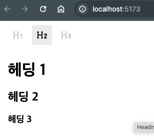
다음으로, 에디터에 렌더링되는 HeadingNode에 CSS를 적용해보겠습니다.
editorTheme.ts 파일을 다음과 같이 준비합시다.
// src/editorTheme.ts

import { EditorThemeClasses } from "lexical";
import styles from "./editorTheme.module.scss";

export const theme: EditorThemeClasses = {
  heading: {
    h1: styles.h1,
    h2: styles.h2,
    h3: styles.h3,
    h4: styles.h4,
    h5: styles.h5,
    h6: styles.h6,
  },
};
EditorThemeClasses는 LexicalEditor에 전달되는 CSS 클래스를 일괄적으로 받는 객체 타입입니다.
다른 요소에 대한 스타일링도 이 객체를 통해 받습니다.
이제 CSS를 아래와 같이 준비합시다.
editorTheme.module.scss 파일입니다.
.h1 {
  font-size: 32px;
  margin-bottom: 24px;
}

.h2 {
  font-size: 24px;
  margin-bottom: 20px;
}

.h3 {
  font-size: 18px;
  margin-bottom: 16px;
}

.h4 {
  font-size: 16px;
  margin-bottom: 16px;
}

.h5 {
  font-size: 14px;
  margin-bottom: 16px;
}

.h6 {
  font-size: 12px;
  margin-bottom: 16px;
}

.quote {
  margin: 16px 0;
  padding: 4px 16px;
  border-left: 4px solid #dddddd;
}

.ul {
  margin-left: 16px;
  list-style-position: inside;
}

.ol {
  margin-left: 16px;
  list-style-position: inside;
}

.listitem {
  margin: 4px 32px;
}

.nestedListItem {
  list-style: none;
}

.listitemChecked,
.listitemUnchecked {
  list-style: none;
  position: relative;
  margin-left: 8px;
  padding-left: 24px;

  &:focus-visible {
    box-shadow: none;
  }

  &::before {
    content: "";
    position: absolute;
    top: 4px;
    left: 4px;
    display: inline-block;
    width: 16px;
    height: 16px;
    border: 1px solid #c5c5c5;
    border-radius: 2px;
  }
}

.listitemChecked {
  &::before {
    background-color: #3b72e9;
  }

  &::after {
    content: "";
    position: absolute;
    top: 8px;
    left: 7px;
    display: inline-block;
    width: 10px;
    height: 5px;
    border-bottom: 2px solid white;
    border-left: 2px solid white;
    transform: rotate(-40deg);
  }
}

.code {
  background-color: #f7fafb;
  font-family: Menlo, Consolas, Monaco, monospace;
  display: block;
  padding: 8px 8px 8px 52px;
  line-height: 1.6;
  font-size: 14px;
  margin: 8px 0;
  tab-size: 2;
  /* white-space: pre; */
  overflow-x: auto;
  position: relative;

  &::before {
    content: attr(data-gutter);
    color: #999;
    position: absolute;
    top: 0;
    left: 0;
    background-color: #d9dddf;
    padding: 8px;
    min-width: 32px;
    height: 100%;
    text-align: right;
  }
}

.tokenComment {
  color: slategray;
}

.tokenPunctuation {
  color: #999;
}

.tokenProperty {
  color: #905;
}

.tokenSelector {
  color: #690;
}

.tokenOperator {
  color: #9a6e3a;
}

.tokenAttr {
  color: #07a;
}

.tokenVariable {
  color: #e90;
}

.tokenFunction {
  color: #dd4a68;
}

.textBold {
  font-weight: bold;
}

.textCode {
  background-color: #e8eced;
  padding: 1px 0.25rem;
  font-family: Menlo, Consolas, Monaco, monospace;
  font-size: 94%;
}

.textItalic {
  font-style: italic;
}

.textStrikethrough {
  text-decoration: line-through;
}

.textSubscript {
  font-size: 0.8em;
  vertical-align: sub;
}

.textSuperscript {
  font-size: 0.8em;
  vertical-align: super;
}

.textUnderline {
  text-decoration: underline;
}

.textUnderlineStrikethrough {
  text-decoration: underline line-through;
}
그리고 이 theme 객체를 LexicalEditor에 전달합니다.
아래와 같이 initialConfig가 전달할 수 있는 인터페이스 역할을 합니다.
// src/Editor.tsx

// 생략
import { theme } from "./editorTheme";

const initialConfig: ComponentProps<typeof LexicalComposer>["initialConfig"] = {
  namespace: "MyEditor",
  onError: (error) => console.error(error),
  nodes: nodes,
  theme: theme,
};

// 생략
이제 HeadingNode가 렌더링하는 뷰에 스타일이 적용됩니다.