Title here
Summary here
June 15, 202414 minutes
안녕하세요!
리액트 네이티브 강좌 5편입니다.
편의를 위해 전체 강좌 링크도 넣었습니다.
리액트 네이티브 강좌. 7편 - 동적인 사용자 인터페이스 구현하기 - Dimensions API와 플랫폼별 코드 작성법
리액트 네이티브 강좌. 9편 - Input and Forms with Switch, KeyboardAvoidingView, Form Validation
리액트 네이티브 강좌. 10편 - Networking 다루기, 데이터 fetching, loading state, error handling
** 목 차 **
flex와 flex direction에 대해 알아봤으니, 이제 정렬과 관련된 속성들에 대해 알아볼 차례입니다.
이번에는 justifyContent 속성에 대해 집중적으로 다뤄보겠습니다.
justifyContent 속성은 주 축(main axis)을 따라 정렬을 한다는 걸 의미합니다.
다양한 값들이 어떻게 작동하는지 UI를 통해 이해해 봅시다.
더 나은 시각화를 위해 이번에도 첫 세 개의 박스만 렌더링하겠습니다.
justifyContent는 컨테이너에 설정하여 그 안의 아이템들의 정렬을 제어하는 속성입니다.
컨테이너 스타일에 justifyContent를 추가해 봅시다.
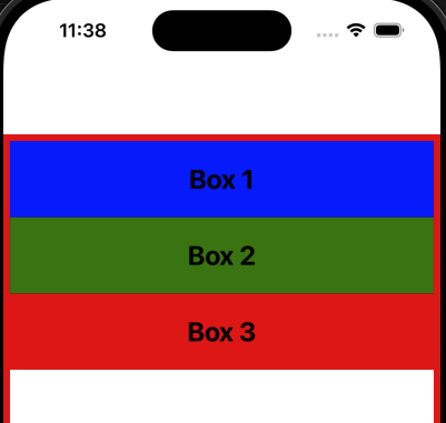
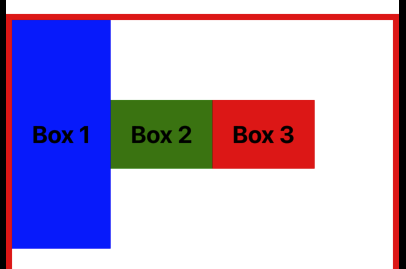
기본적으로 justifyContent는 flex-start 값으로 설정되어 있습니다.
이 값은 flex 아이템들을 주 축의 시작 부분에 배치합니다.
주 축이 위에서 아래로 흐르기 때문에 아이템들은 뷰의 상단에 배치됩니다.
import { View, StyleSheet } from "react-native";
import Box from "../components/Box";

const App = () => {
  return (
    <View style={styles.container}>
      <Box style={{ backgroundColor: "blue" }}>Box 1</Box>
      <Box style={{ backgroundColor: "green" }}>Box 2</Box>
      <Box style={{ backgroundColor: "red" }}>Box 3</Box>
      {/* <Box style={{ backgroundColor: "purple" }}>Box 4</Box>
      <Box style={{ backgroundColor: "orange" }}>Box 5</Box>
      <Box style={{ backgroundColor: "pink" }}>Box 6</Box>
      <Box style={{ backgroundColor: "yellow" }}>Box 7</Box> */}
    </View>
  );
};

const styles = StyleSheet.create({
  container: {
    flex: 1,
    justifyContent: 'flex-start',
    marginTop: 64,
    borderWidth: 6,
    borderColor: "red",
  },
});

export default App;justifyContent를 flex-start로 설정했을 때 아무런 차이가 없다는 것을 확인할 수 있습니다.
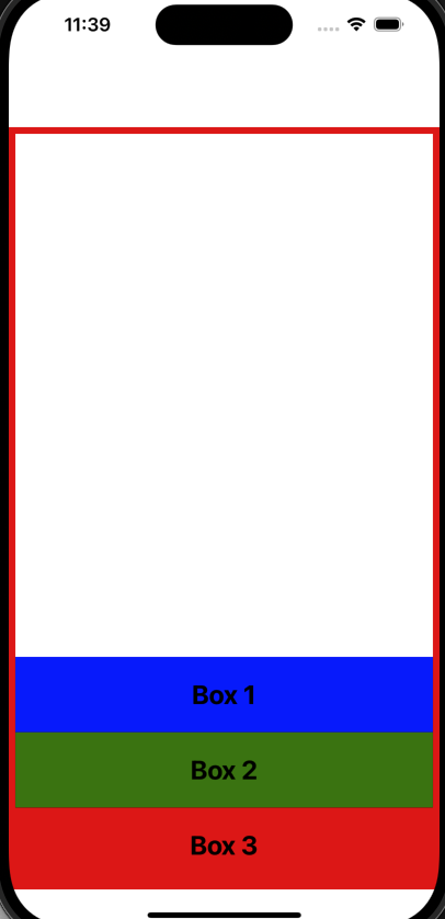
두 번째 가능한 값은 flex-end로, 이 값은 flex 아이템들을 주 축의 끝 부분에 배치합니다.
파일을 저장하면 아이템들이 주 축의 끝 부분에 배치되는 것을 볼 수 있습니다.
중요한 점은 박스 1이 맨 아래에 있는 것이 아니라, 전체 flex 아이템 그룹이 아래로 밀린다는 것입니다.
const styles = StyleSheet.create({
container: {
flex: 1,
justifyContent: 'flex-end',
marginTop: 64,
borderWidth: 6,
borderColor: "red",
},
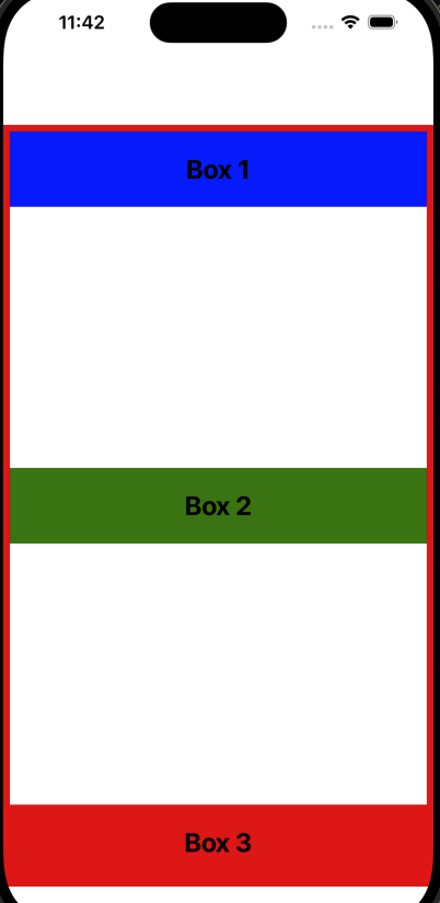
});주 축의 중앙에 콘텐츠를 정렬할 수도 있습니다.
값을 center로 설정하고 파일을 저장해 봅시다.
이제 콘텐츠가 주 축의 중앙에 배치됩니다.
const styles = StyleSheet.create({
  container: {
    flex: 1,
    justifyContent: 'center',
    marginTop: 64,
    borderWidth: 6,
    borderColor: "red",
  },
});
이렇게 상단, 하단, 중앙에 정렬하는 세 가지 속성을 기대할 수 있습니다.
그러나 flexbox는 컨테이너 내의 여유 공간을 어떻게 분배할지 제어할 수 있는 추가 값을 제공합니다.
그 중 하나가 space-between입니다.
파일을 저장하면 남은 여유 공간이 균등하게 나누어져 flex 아이템 사이에 추가되는 것을 볼 수 있습니다.
const styles = StyleSheet.create({
  container: {
    flex: 1,
    justifyContent: 'space-between',
    marginTop: 64,
    borderWidth: 6,
    borderColor: "red",
  },
});
때로는 첫 번째 아이템 앞과 마지막 아이템 뒤에도 공간이 필요할 수 있습니다.
이럴 때 사용하는 값이 space-around입니다.
파일을 저장하면 시작과 끝에 공간이 생기는 것을 볼 수 있습니다.
이 공간은 flex 아이템 사이의 공간의 절반입니다.
예를 들어, 아이템 사이의 공간이 20픽셀이라면 시작과 끝의 공간은 10픽셀이 됩니다.
const styles = StyleSheet.create({
  container: {
    flex: 1,
    justifyContent: 'space-around',
    marginTop: 64,
    borderWidth: 6,
    borderColor: "red",
  },
});
만약 아이템 시작과 끝의 공간도 동일하게 하고 싶다면, space-evenly 값을 사용하면 됩니다.
값을 변경하고 파일을 저장하면 여유 공간이 컨테이너 내에서 균등하게 분배되는 것을 볼 수 있습니다.
const styles = StyleSheet.create({
  container: {
    flex: 1,
    justifyContent: 'space-evenly',
    marginTop: 64,
    borderWidth: 6,
    borderColor: "red",
  },
});
중요한 점은 justifyContent 속성은 주 축을 기준으로 아이템을 정렬한다는 것입니다.
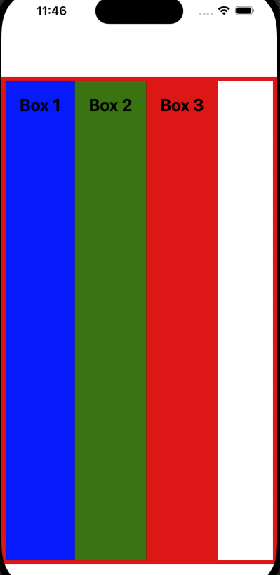
따라서 flexDirection을 row로 설정하면 주 축이 왼쪽에서 오른쪽으로 변경되어 justifyContent는 수평 정렬을 담당하게 됩니다.
const styles = StyleSheet.create({
  container: {
    flex: 1,
    flexDirection: 'row',
    justifyContent: 'flex-start', // or flex-end, center
    marginTop: 64,
    borderWidth: 6,
    borderColor: "red",
  },
});
위 그림처럼 justifyContent를 flex-start로 설정하고 flex-direction을 row로 설정하면 모든 아이템이 왼쪽으로 정렬됩니다.
값을 flex-end로 설정하면 모든 아이템이 오른쪽으로 정렬됩니다.
값을 center로 설정하면 콘텐츠가 수평으로 중앙에 정렬됩니다.
space-between, space-around, space-evenly를 한번 시도해 보시기 바랍니다.
justifyContent 속성은 아이템을 정렬하고 컨테이너 내의 여유 공간을 분배하는 데 사용됩니다.
정렬은 항상 주 축을 기준으로 합니다.
가능한 값은 flex-start, flex-end, center, space-between, space-around, space-evenly입니다.
이번에는 두 번째 정렬 속성인 alignItems 속성에 대해 알아보겠습니다.
alignItems 속성은 컨테이너의 교차 축을 따라 플렉스 아이템을 배치하는 기본 동작을 정의합니다.
이 속성은 justifyContent와 유사하게 작동하지만, 수직 방향으로 작동합니다.
UI를 통해 각 값이 어떻게 작동하는지 이해해보겠습니다.
먼저, 컨테이너 스타일에 alignItems를 추가해보겠습니다.
기본적으로 alignItems의 값은 stretch로 설정되어 있습니다.
이는 플렉스 아이템들이 교차 축의 전체 길이를 따라 늘어난다는 것을 의미합니다.
교차 축은 일반적으로 왼쪽에서 오른쪽으로 흐릅니다.
import { View, StyleSheet } from "react-native";
import Box from "../components/Box";

const App = () => {
  return (
    <View style={styles.container}>
      <Box style={{ backgroundColor: "blue" }}>Box 1</Box>
      <Box style={{ backgroundColor: "green" }}>Box 2</Box>
      <Box style={{ backgroundColor: "red" }}>Box 3</Box>
      {/* <Box style={{ backgroundColor: "purple" }}>Box 4</Box>
      <Box style={{ backgroundColor: "orange" }}>Box 5</Box>
      <Box style={{ backgroundColor: "pink" }}>Box 6</Box>
      <Box style={{ backgroundColor: "yellow" }}>Box 7</Box> */}
    </View>
  );
};

const styles = StyleSheet.create({
  container: {
    flex: 1,
    alignItems: 'stretch',
    marginTop: 64,
    borderWidth: 6,
    borderColor: "red",
  },
});

export default App;stretch가 기본값이기 때문에, 동일한 값으로 설정해도 눈에 보이는 변화는 없습니다.
각 박스는 교차 축 방향으로 왼쪽에서 오른쪽으로 늘어납니다.
두 번째 값은 flex-start입니다.
이 값은 모든 아이템을 교차 축의 시작 지점으로 밀어 넣습니다.
const styles = StyleSheet.create({
  container: {
    flex: 1,
    alignItems: 'flex-start',
    marginTop: 64,
    borderWidth: 6,
    borderColor: "red",
  },
});
세 번째 값은 flex-end입니다.
이 값은 아이템들을 교차 축의 끝 지점으로 밀어 넣습니다.
const styles = StyleSheet.create({
  container: {
    flex: 1,
    alignItems: 'flex-end',
    marginTop: 64,
    borderWidth: 6,
    borderColor: "red",
  },
});
네 번째 값은 center입니다.
이 값은 콘텐츠를 교차 축의 가운데로 정렬합니다.
const styles = StyleSheet.create({
  container: {
    flex: 1,
    alignItems: 'center',
    marginTop: 64,
    borderWidth: 6,
    borderColor: "red",
  },
});
마지막으로 baseline 값을 알아보겠습니다.
이 값은 잘 사용되지 않지만, 이해하는 것이 매우 중요한데요.
베이스라인은 ‘baseline’ 단어 뜻에서 알 수 있듯이 문자가 앉아 있는 선으로 생각할 수 있습니다.
위 그림에서 보시면 baseline은 각각의 문자인 ABCDE가 위치해 있는 점선이 그 베이스라인입니다.
플렉스박스에서 baseline 값은 플렉스 아이템의 콘텐츠 베이스라인을 기준으로 정렬합니다.
테스트를 위해 Box 1의 수직 패딩값을 100으로 두고 flexDirection을 row값으로 지정하겠습니다.
import { View, StyleSheet } from "react-native";
import Box from "../components/Box";

const App = () => {
  return (
    <View style={styles.container}>
      <Box style={{ backgroundColor: "blue", paddingVertical: 100 }}>Box 1</Box>
      <Box style={{ backgroundColor: "green" }}>Box 2</Box>
      <Box style={{ backgroundColor: "red" }}>Box 3</Box>
      {/* <Box style={{ backgroundColor: "purple" }}>Box 4</Box>
      <Box style={{ backgroundColor: "orange" }}>Box 5</Box>
      <Box style={{ backgroundColor: "pink" }}>Box 6</Box>
      <Box style={{ backgroundColor: "yellow" }}>Box 7</Box> */}
    </View>
  );
};

const styles = StyleSheet.create({
  container: {
    flex: 1,
    flexDirection: "row",
    alignItems: "baseline",
    marginTop: 64,
    borderWidth: 6,
    borderColor: "red",
  },
});

export default App;
파일을 저장하면, 각 아이템 내부의 텍스트가 동일한 베이스라인에 맞춰진 것을 볼 수 있습니다.
각 아이템의 높이나 패딩이 어떻게 설정되었든지 상관없이 텍스트 콘텐츠는 동일한 베이스라인에 맞춰집니다.
요약하자면, alignItems 속성은 아이템들을 교차 축을 따라 정렬합니다.
가능한 값들은 flex-start, flex-end, center, baseline, 그리고 기본 값인 stretch입니다.
이번에는 세 번째 정렬 속성인 alignSelf에 대해 알아보겠습니다.
alignItems가 컨테이너에 적용되어 모든 아이템의 정렬을 제어하는 반면, alignSelf는 개별 아이템에 적용되어 각 아이템의 정렬을 독립적으로 제어할 수 있습니다.
alignSelf에 사용할 수 있는 값들은 alignItems에서 사용되는 값들과 유사합니다.
이번에는 모든 박스를 렌더링하여 alignSelf의 다양한 값을 시연해 보겠습니다.
먼저, alignSelf의 첫 번째 값인 flex-start를 살펴보겠습니다.
이 값은 아이템을 교차 축의 시작 지점에 정렬합니다.
import { View, StyleSheet } from "react-native";
import Box from "../components/Box";

const App = () => {
  return (
    <View style={styles.container}>
      <Box style={{ backgroundColor: "blue", alignSelf: 'flex-start' }}>Box 1</Box>
      <Box style={{ backgroundColor: "green" }}>Box 2</Box>
      <Box style={{ backgroundColor: "red" }}>Box 3</Box>
      <Box style={{ backgroundColor: "purple" }}>Box 4</Box>
      <Box style={{ backgroundColor: "orange" }}>Box 5</Box>
      <Box style={{ backgroundColor: "pink" }}>Box 6</Box>
      <Box style={{ backgroundColor: "yellow" }}>Box 7</Box>
    </View>
  );
};

const styles = StyleSheet.create({
  container: {
    flex: 1,
    marginTop: 64,
    borderWidth: 6,
    borderColor: "red",
  },
});

export default App;
첫 번째 박스는 alignSelf: 'flex-start'로 설정되어 교차 축의 시작 지점으로 정렬됩니다.
두 번째 값은 flex-end입니다.
이 값은 아이템을 교차 축의 끝 지점에 정렬합니다.
<Box style={{ backgroundColor: "green", alignSelf: "flex-end" }}>
  Box 2
</Box>
세 번째 값은 center입니다.
이 값은 아이템을 교차 축의 가운데에 정렬합니다.
<Box style={{ backgroundColor: "red", alignSelf: "center" }}>Box 3</Box>네 번째 값은 stretch입니다.
이 값은 아이템을 교차 축의 시작부터 끝까지 늘립니다.
<Box style={{ backgroundColor: "purple", alignSelf: 'stretch' }}>Box 4</Box>그러나 박스 5, 박스 6, 박스 7도 stretch된 것을 볼 수 있습니다.
이는 stretch가 alignSelf의 기본값이 아니라, 부모 플렉스 컨테이너의 alignItems 속성이 stretch로 설정되어 있기 때문입니다.
alignSelf의 기본값은 auto이며, 이는 부모 플렉스 컨테이너의 alignItems 속성 값을 상속합니다.
따라서 박스 5에서 7은 부모 컨테이너의 alignItems 속성이 stretch로 설정되어 있기 때문에 stretch된 것입니다.
const styles = StyleSheet.create({
  container: {
    flex: 1,
    alignItems: 'flex-end',
    marginTop: 64,
    borderWidth: 6,
    borderColor: "red",
  },
});
위와 같이 부모 플렉스 컨테이너의 alignItems 속성 값을 flex-end로 설정하면,
이 경우, 박스 5에서 7은 flex-end로 정렬됩니다.
요약하자면, alignSelf 속성은 개별 아이템의 정렬을 제어하며, auto, flex-start, flex-end, center, stretch 값을 가집니다.
alignSelf 속성이 auto 값 외의 값으로 지정되면, 항상 부모 플렉스 컨테이너의 alignItems 값을 무시합니다.
이번에는 flexWrap 속성에 대해 알아보겠습니다.
이 속성은 컨테이너 내에서 공간이 제한될 때 플렉스 아이템들이 어떻게 동작할지를 제어할 수 있게 해줍니다.
현재 우리의 컨테이너는 flex: 1로 설정되어 있어 사용 가능한 모든 공간을 차지하고 있습니다.
하지만 제한된 공간에서 작업해야 할 때는 어떻게 될까요?
flex: 1을 주석 처리하고 height 값을 설정해보겠습니다.
import { View, StyleSheet } from "react-native";
import Box from "../components/Box";

const App = () => {
  return (
    <View style={styles.container}>
      <Box style={{ backgroundColor: "blue" }}>Box 1</Box>
      <Box style={{ backgroundColor: "green" }}>Box 2</Box>
      <Box style={{ backgroundColor: "red" }}>Box 3</Box>
      <Box style={{ backgroundColor: "purple" }}>Box 4</Box>
      <Box style={{ backgroundColor: "orange" }}>Box 5</Box>
      <Box style={{ backgroundColor: "pink" }}>Box 6</Box>
      <Box style={{ backgroundColor: "yellow" }}>Box 7</Box>
    </View>
  );
};

const styles = StyleSheet.create({
  container: {
    // flex: 1,
    height: 300,
    marginTop: 64,
    borderWidth: 6,
    borderColor: "red",
  },
});

export default App;
UI를 보면 공간이 부족할 때 아이템들이 컨테이너를 넘치는 것을 볼 수 있습니다.
이 오버플로우를 방지하고 제한된 공간을 더 효과적으로 처리하기 위해 flexWrap 속성을 사용할 수 있습니다.
컨테이너의 스타일 객체에 flexWrap 속성을 추가하겠습니다.
flexWrap 속성은 세 가지 가능한 값을 가질 수 있습니다.
첫 번째 값은 nowrap이며, 기본값입니다.
const styles = StyleSheet.create({
  container: {
    // flex: 1,
    flexWrap: "nowrap",
    height: 300,
    marginTop: 64,
    borderWidth: 6,
    borderColor: "red",
  },
});
UI를 확인해보면 변화가 없고 아이템들이 한 줄에 유지되는 것을 볼 수 있습니다.
아이템들을 컨테이너 내에서 랩하고 싶다면 wrap 값을 설정합니다.
const styles = StyleSheet.create({
  container: {
    // flex: 1,
    flexWrap: "wrap",
    height: 300,
    marginTop: 64,
    borderWidth: 6,
    borderColor: "red",
  },
});
UI를 보면 아이템들이 다음 열로 랩(wrap)된 것을 볼 수 있습니다.
컨테이너 높이를 600으로 확장하면, 모든 아이템을 한 줄에 수용할 수 있어 랩이 발생하지 않습니다.
const styles = StyleSheet.create({
  container: {
    // flex: 1,
    flexWrap: "wrap",
    height: 600,
    marginTop: 64,
    borderWidth: 6,
    borderColor: "red",
  },
});
마지막 값은 wrap-reverse입니다.
이 값은 아이템들을 교차 축의 끝에서 시작하여 이전 열로 랩합니다.
const styles = StyleSheet.create({
  container: {
    // flex: 1,
    flexWrap: "wrap-reverse",
    height: 600,
    marginTop: 64,
    borderWidth: 6,
    borderColor: "red",
  },
});
UI를 보면 역방향으로 랩된 것을 볼 수 있습니다.
wrap-reverse가 아이템들을 역순으로 랩하기 시작한다고 혼동하지 마세요.
height를 다시 300으로 조정해 보겠습니다.
const styles = StyleSheet.create({
  container: {
    // flex: 1,
    flexWrap: "wrap-reverse",
    height: 300,
    marginTop: 64,
    borderWidth: 6,
    borderColor: "red",
  },
});
아이템 1은 오른쪽 열로 이동하지 않습니다.
랩은 항상 마지막 아이템부터 시작되며, wrap-reverse는 다음 열 대신 이전 열로 아이템을 밀어 넣습니다.
아이템의 수평 랩핑도 가능합니다.
이를 위해 flexDirection을 row로 변경하고 다시 flex: 1을 사용해보겠습니다.
const styles = StyleSheet.create({
  container: {
    flex: 1,
    flexDirection: 'row',
    flexWrap: "wrap",
    marginTop: 64,
    borderWidth: 6,
    borderColor: "red",
  },
});
이제 아이템들이 다음 행으로 랩된 것을 볼 수 있습니다.
값을 wrap-reverse로 변경하면 아이템들이 교차 축의 끝에서 시작하여 위쪽 행으로 랩됩니다.
const styles = StyleSheet.create({
  container: {
    flex: 1,
    flexDirection: 'row',
    flexWrap: "wrap-reverse",
    marginTop: 64,
    borderWidth: 6,
    borderColor: "red",
  },
});
요약하자면, flexWrap 속성은 컨테이너 내에서 플렉스 아이템들의 랩핑 동작을 제어하는 데 유용한 도구입니다.
가능한 값들은 nowrap(기본값), wrap(다음 행이나 열로 랩), wrap-reverse(이전 행이나 열로 랩)입니다.
다음으로 알아볼 플렉스박스 속성은 alignContent 속성입니다.
alignContent 속성은 교차 축을 따라 콘텐츠의 줄을 정렬합니다.
이는 alignItems 속성이 개별 아이템을 교차 축을 따라 정렬하는 것과 유사합니다.
하지만 중요한 조건은 컨테이너 내에 여러 열이나 행이 있어야 한다는 것입니다.
여러 가지 가능한 값을 더 잘 이해하기 위해, 코드로 돌아가서 컨테이너에 높이를 설정하고 랩핑을 활성화해 보겠습니다.
flex: 1을 주석 처리하고 높이를 300으로 설정한 다음, flexWrap을 wrap으로 설정합니다.
랩핑은 콘텐츠를 두 열로 강제하는 데 필수적입니다.
import { View, StyleSheet } from "react-native";
import Box from "../components/Box";

const App = () => {
  return (
    <View style={styles.container}>
      <Box style={{ backgroundColor: "blue" }}>Box 1</Box>
      <Box style={{ backgroundColor: "green" }}>Box 2</Box>
      <Box style={{ backgroundColor: "red" }}>Box 3</Box>
      <Box style={{ backgroundColor: "purple" }}>Box 4</Box>
      <Box style={{ backgroundColor: "orange" }}>Box 5</Box>
      <Box style={{ backgroundColor: "pink" }}>Box 6</Box>
      <Box style={{ backgroundColor: "yellow" }}>Box 7</Box>
    </View>
  );
};

const styles = StyleSheet.create({
  container: {
    // flex: 1,
    height: 300,
    flexWrap: "wrap",
    marginTop: 64,
    borderWidth: 6,
    borderColor: "red",
  },
});

export default App;
파일을 저장하고 UI를 보면 콘텐츠가 두 열로 랩핑된 것을 볼 수 있습니다.
alignContent 속성은 이 콘텐츠의 줄을 교차 축을 따라 정렬하는 데 사용됩니다.
기본 값은 flex-start로, 두 열을 교차 축의 시작 지점에 배치합니다.
const styles = StyleSheet.create({
  container: {
    // flex: 1,
    height: 300,
    flexWrap: "wrap",
    alignContent: 'flex-start',
    marginTop: 64,
    borderWidth: 6,
    borderColor: "red",
  },
});
UI를 보면 변화가 없음을 알 수 있습니다.
다음 가능한 값은 flex-end로, 콘텐츠를 교차 축의 끝 지점으로 밀어 넣습니다.
const styles = StyleSheet.create({
  container: {
    // flex: 1,
    height: 300,
    flexWrap: "wrap",
    alignContent: 'flex-end',
    marginTop: 64,
    borderWidth: 6,
    borderColor: "red",
  },
});
파일을 저장하면 콘텐츠가 오른쪽에 정렬된 것을 볼 수 있습니다.
또한, center 값을 지정하여 콘텐츠를 가운데에 정렬할 수 있습니다.
const styles = StyleSheet.create({
  container: {
    // flex: 1,
    height: 300,
    flexWrap: "wrap",
    alignContent: 'center',
    marginTop: 64,
    borderWidth: 6,
    borderColor: "red",
  },
});
파일을 저장하면 콘텐츠가 가운데에 완벽하게 정렬된 것을 볼 수 있습니다.
네 번째 값은 stretch로, 열을 교차 축의 시작부터 끝까지 늘립니다.
const styles = StyleSheet.create({
  container: {
    // flex: 1,
    height: 300,
    flexWrap: "wrap",
    alignContent: 'stretch',
    marginTop: 64,
    borderWidth: 6,
    borderColor: "red",
  },
});
파일을 저장하면 두 열이 함께 늘어나서 UI에서 사용 가능한 전체 수평 공간을 차지하는 것을 볼 수 있습니다.
다음 값은 space-between으로, 모든 여분의 공간을 줄 사이에 배치합니다.
const styles = StyleSheet.create({
  container: {
    // flex: 1,
    height: 300,
    flexWrap: "wrap",
    alignContent: 'space-between',
    marginTop: 64,
    borderWidth: 6,
    borderColor: "red",
  },
});
파일을 저장하면 두번째 열에 문제가 생긴 것을 볼 수 있습니다.
Box 컴포넌트의 크기가 커서 그런겁니다.
Box 컴포넌트로 가서 크기를 줄여보겠습니다.
import { View, Text, StyleSheet } from "react-native";
const Box = ({ children, style }) => {
return (
<View style={[styles.box, style]}>
<Text style={styles.text}>{children}</Text>
</View>
);
};
const styles = StyleSheet.create({
box: {
backgroundColor: "white",
padding: 20,
height: 50,
width: 50,
},
text: {
fontSize: 24,
fontWeight: "bold",
textAlign: "center",
},
});
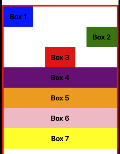
export default Box;위 그림을 보시면 Box의 크기를 너무 극단적으로 줄인거 같습니다.
아무튼 space-between의 속성에 대해 알수 있을 겁니다.
다음 값은 space-around로, 줄 주위에 공간을 배치합니다.
중앙 부분은 가장자리보다 두 배의 공간을 가집니다.
const styles = StyleSheet.create({
  container: {
    // flex: 1,
    height: 300,
    flexWrap: "wrap",
    alignContent: 'space-around',
    marginTop: 64,
    borderWidth: 6,
    borderColor: "red",
  },
});
파일을 저장하면 중앙 부분이 가장자리보다 두 배의 공간을 가진 것을 볼 수 있습니다.
마지막으로, space-evenly입니다.
const styles = StyleSheet.create({
container: {
// flex: 1,
height: 300,
flexWrap: "wrap",
alignContent: 'space-evenly',
marginTop: 64,
borderWidth: 6,
borderColor: "red",
},
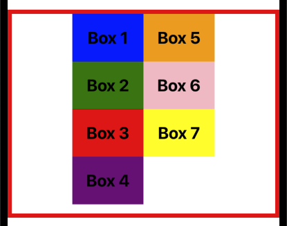
});위 그림을 보시면 열 사이의 공간이 딱 3등분된 걸 볼 수 있습니다.
요약하자면, alignContent 속성은 React Native에서 교차 축을 따라 콘텐츠의 줄을 정렬하고 부모 컨테이너 내에서 여분의 공간을 분배하는 데 사용됩니다.
가능한 값들은 flex-start(기본값), flex-end, center, stretch, space-between, space-around, space-evenly입니다.
이번에는 React Native에서 행과 열 사이의 간격을 관리할 수 있는 플렉스 속성들을 알아보겠습니다.
주로 다룰 속성은 rowGap, columnGap, 그리고 gap입니다.
코드로 돌아가서 이 속성들이 어떻게 작동하는지 살펴보겠습니다.
먼저, 컨테이너에 여러 개의 행과 열이 있는지 확인해보겠습니다.
이를 위해 flex: 1을 주석 처리하고 높이를 300으로 설정한 다음, flexWrap을 wrap으로 설정하겠습니다.
import { View, StyleSheet } from "react-native";
import Box from "../components/Box";

const App = () => {
  return (
    <View style={styles.container}>
      <Box style={{ backgroundColor: "blue" }}>Box 1</Box>
      <Box style={{ backgroundColor: "green" }}>Box 2</Box>
      <Box style={{ backgroundColor: "red" }}>Box 3</Box>
      <Box style={{ backgroundColor: "purple" }}>Box 4</Box>
      <Box style={{ backgroundColor: "orange" }}>Box 5</Box>
      <Box style={{ backgroundColor: "pink" }}>Box 6</Box>
      <Box style={{ backgroundColor: "yellow" }}>Box 7</Box>
    </View>
  );
};

const styles = StyleSheet.create({
  container: {
    // flex: 1,
    height: 300,
    flexWrap: "wrap",
    marginTop: 64,
    borderWidth: 6,
    borderColor: "red",
  },
});

export default App;
이 스타일이 적용되면, UI에서 아이템들이 행과 열로 정렬된 것을 볼 수 있습니다.
이제 각 속성들을 살펴보겠습니다.
rowGaprowGap 속성은 행 사이의 간격을 설정합니다.
예를 들어, rowGap을 20으로 설정해보겠습니다.
const styles = StyleSheet.create({
  container: {
    // flex: 1,
    height: 300,
    flexWrap: "wrap",
    rowGap: 20,
    marginTop: 64,
    borderWidth: 6,
    borderColor: "red",
  },
});
파일을 저장하면, 행 사이에 간격이 생긴 것을 볼 수 있습니다.
columnGapcolumnGap 속성은 열 사이의 간격을 설정합니다.
이를 30으로 설정해보겠습니다.
const styles = StyleSheet.create({
  container: {
    // flex: 1,
    height: 300,
    flexWrap: "wrap",
    rowGap: 20,
    columnGap: 30,
    marginTop: 64,
    borderWidth: 6,
    borderColor: "red",
  },
});
파일을 저장하면, 열 사이에도 간격이 생긴 것을 볼 수 있습니다.
gapgap 속성은 행과 열 모두에 동일한 간격을 설정할 때 사용합니다.
gap을 10으로 설정하고, rowGap과 columnGap을 주석 처리해보겠습니다.
const styles = StyleSheet.create({
  container: {
    // flex: 1,
    height: 300,
    flexWrap: "wrap",
    gap: 10,
    // rowGap: 20,
    // columnGap: 30,
    marginTop: 64,
    borderWidth: 6,
    borderColor: "red",
  },
});
파일을 저장하면, 행과 열 모두에 동일한 작은 간격이 생긴 것을 볼 수 있습니다.
요약하자면, 열 사이의 간격을 설정하려면 columnGap 속성을 사용하고, 행 사이의 간격을 설정하려면 rowGap 속성을 사용합니다.
행과 열 모두에 동일한 간격을 설정하려면 gap 속성을 사용하면 됩니다.